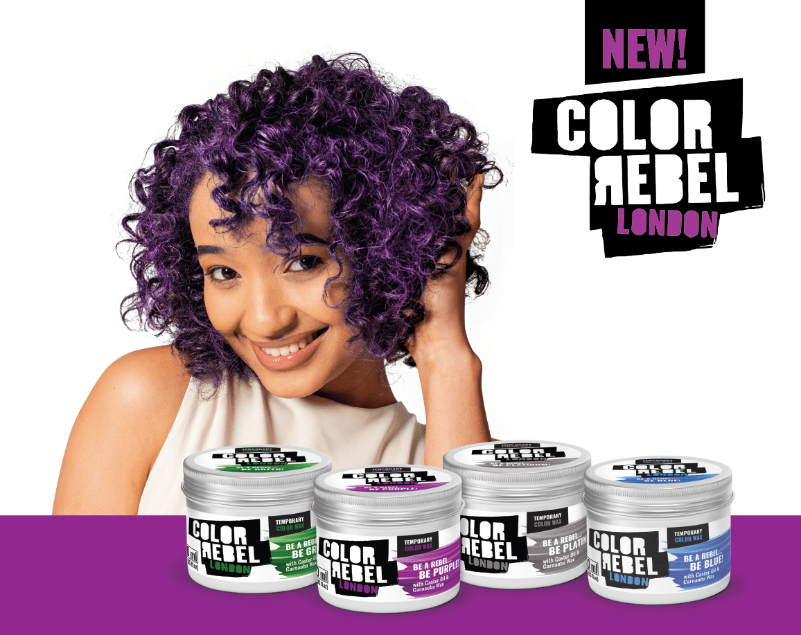
COLOR REBEL
Project Overview: Color Rebel Temporary Color Wax: Bold, Safe, and Stylish
Objective:
To extend the Color Rebel London brand into the growing trend of temporary hair color waxes, creating a packaging range that communicates boldness, individuality, and safety, while appealing to fashion-forward consumers.
Approach:
We embraced the rebellious spirit of the Color Rebel brand, crafting packaging that stands out on shelves and connects with trend-conscious consumers:
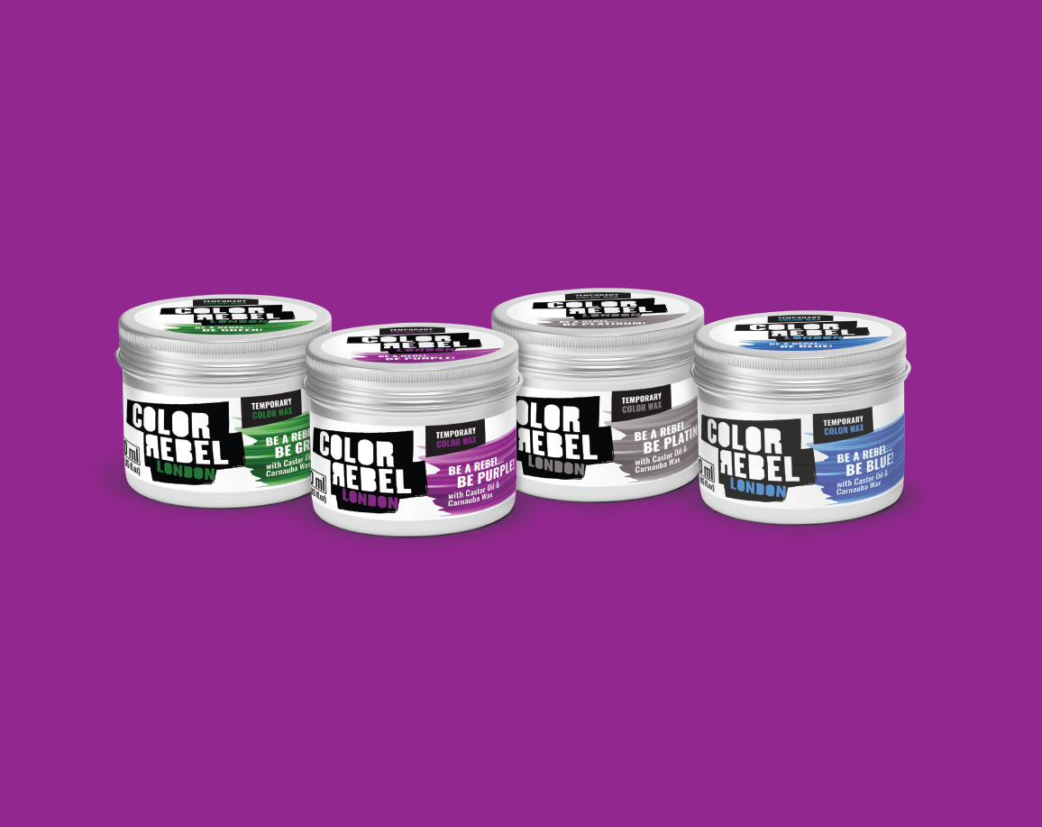
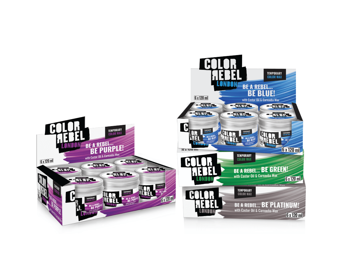
Funky individuality: Each variant is represented by bright, bold color strokes resembling paintbrush effects, reflecting the fun and expressive nature of the product. Taglines like “Be a Rebel… Be Purple/Blue/Green/Platinum” invite consumers to experiment and express their personality through vibrant colors.
Clear communication: Key benefits such as “Easy to Color,” “Easy to Wash,” and “For All Hair Types” are prominently displayed, addressing consumer priorities.
Safe and nourishing formula: The chemical-free benefits (No Ammonia, No Peroxide, No Parabens) and nourishing ingredients like castor oil and carnauba wax are clearly highlighted, emphasizing safety and hair care.
Trend-driven appeal: The packaging design draws inspiration from social media trends, tapping into the contemporary appeal of temporary, damage-free hair color transformations.
Outcome:
The packaging blends the rebellious identity of Color Rebel with a fresh, modern aesthetic that appeals to trendsetters. It conveys the product’s vibrant, fun personality while reassuring consumers about its safety and ease of use.
WHAT WE DID:
Identity Design | Brand Positioning | Packaging Design | Artwork | 3D Rendering
- Date November 27, 2024
- Tags 3D Rendering, Artwork, Brand Positioning, Logo Design, Package Design