RED TRACTOR
Project Overview: Red Tractor – Premium Potting Mix Packaging
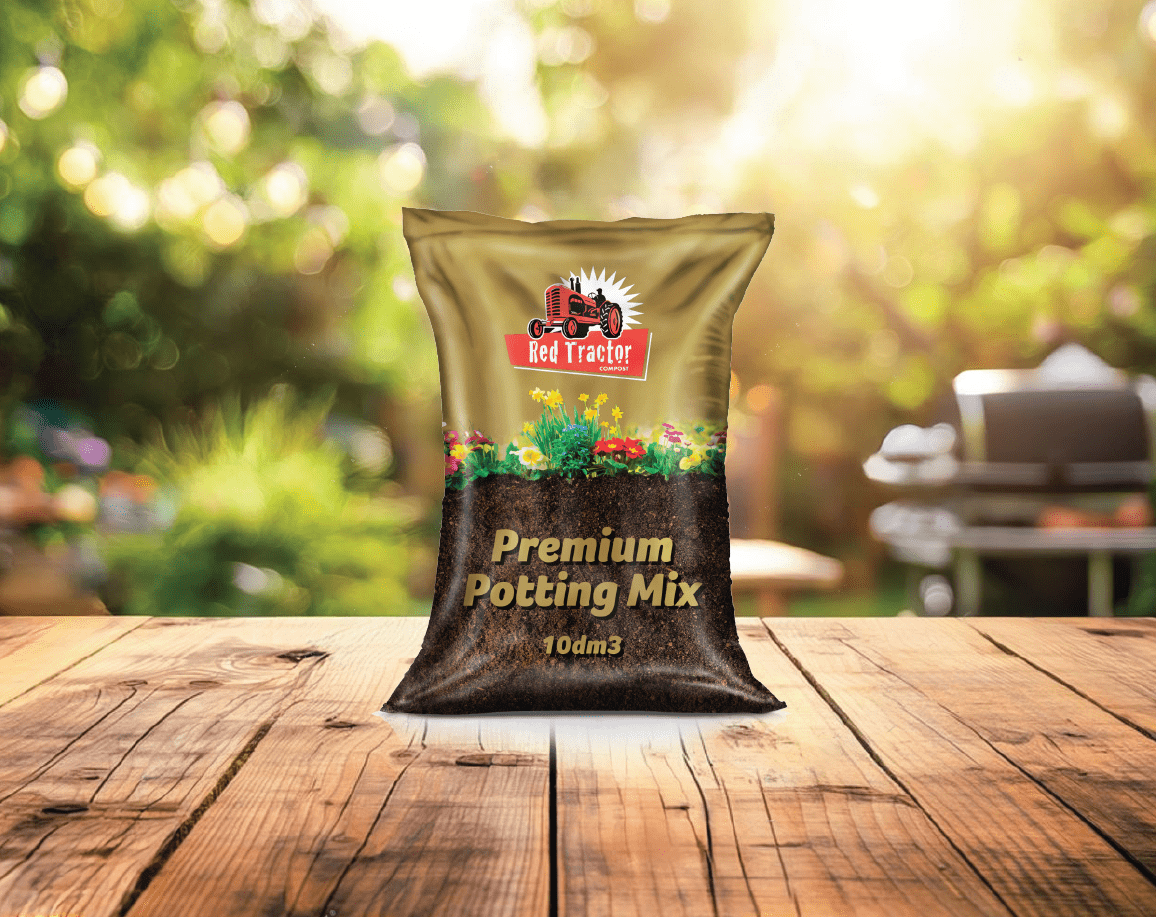
Objective:
To launch Red Tractor into a new category with premium potting soil, creating standout packaging that reflects the product’s superior quality while maintaining the trusted Red Tractor identity.
Approach:
We got our hands dirty—literally and creatively—to craft a design that captures the essence of gardening. Leveraging Red Tractor’s well-recognized logo, we integrated gold accents to evoke a sense of premium quality. The packaging features an authentic photograph of nutrient-rich soil, paired with flourishing plants to highlight the product’s benefits. This approach adds a near 3D effect, immersing the consumer in the lush, vibrant results they can expect.
To bring it all together, we introduced the punchline “Let’s get our hands dirty!”, celebrating the joy of gardening and connecting with hobbyists and professionals alike.
Outcome:
The design effectively establishes Red Tractor’s presence in this new category, combining a trusted brand identity with a modern, premium aesthetic. It communicates quality, performance, and the rewarding experience of gardening, making it an instant standout on shelves.
WHAT WE DID:
Identity Design | Brand Positioning | Packaging Design | Artwork | 3D Rendering
- Date November 27, 2023
- Tags 3D Rendering, Artwork, Brand Positioning, Logo Design, Package Design