HI BABY
Project Overview: Hi Baby Diapers: Packaging Designed for Moms and Their Little Ones
Objective:
To create a thoughtful and engaging packaging range for the “Hi Baby” diaper brand that appeals to mothers by ensuring clarity, emotional connection, and product transparency.
Approach:
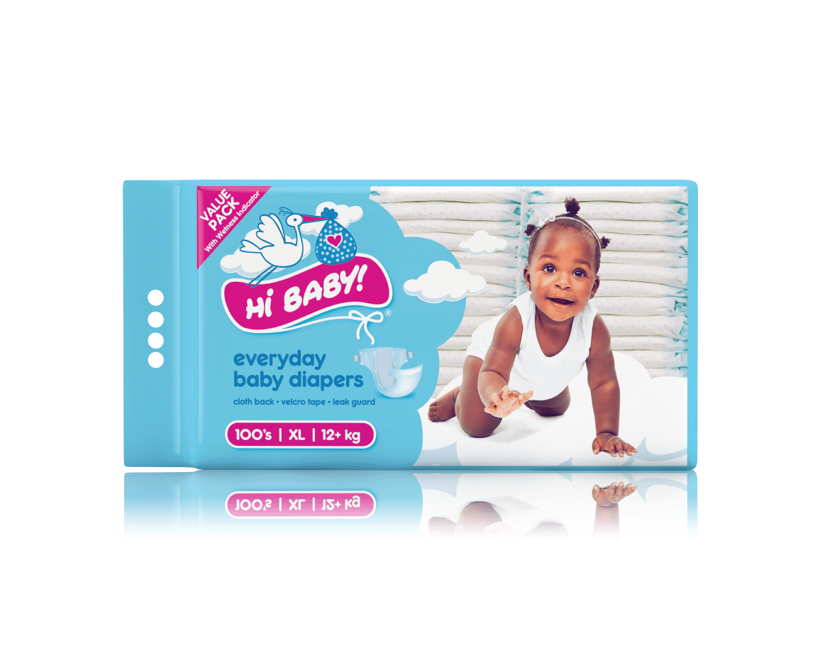
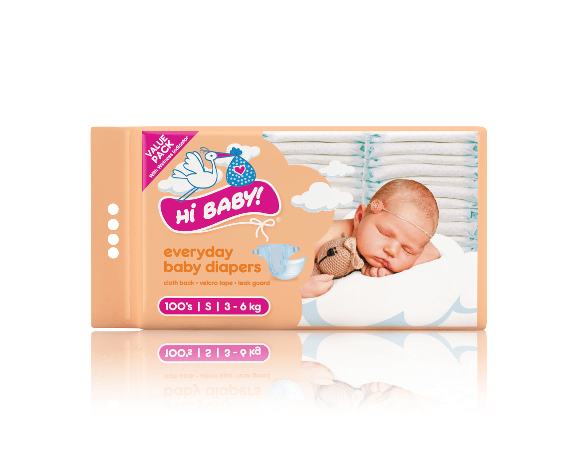
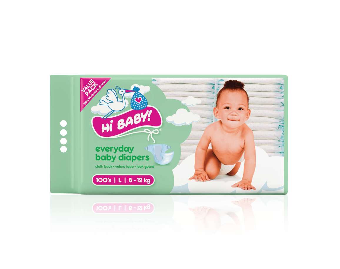
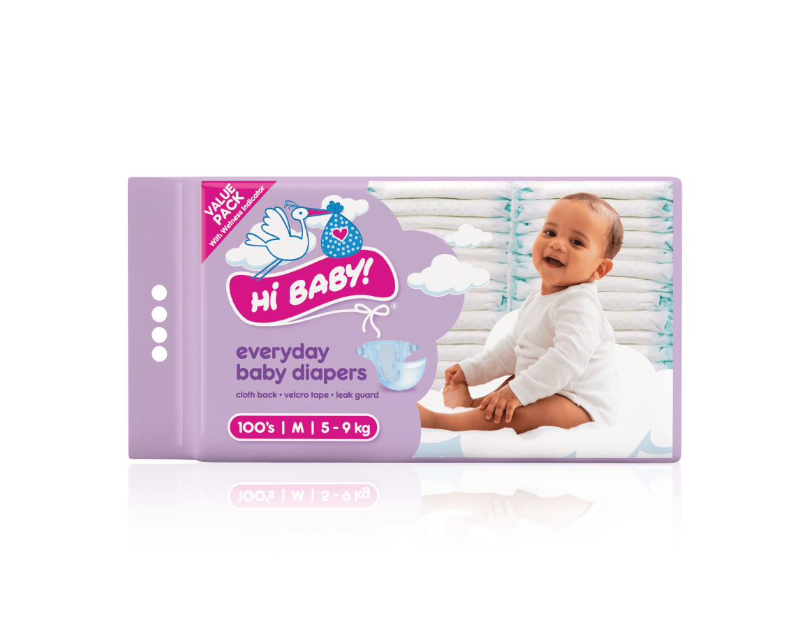
Building on the established “Hi Baby” brand identity, featuring the signature stork carrying a baby, we created packaging that is both functional and visually delightful.
Brand integration: The recognizable stork logo was retained, paired with soft cloud effects across the design to evoke a sense of comfort, care, and gentleness.
Size clarity: Each pack includes a baby photo corresponding to the diaper size, alongside clear size markers for easy identification.
Colour coding: Gentle pastel hues differentiate sizes, making the shopping experience seamless for busy moms.
Key features: Essential benefits such as cloth backing for breathability, Velcro tape for adjustability, and the indispensable “Leak Guard” are prominently displayed to reassure consumers.
Product window: A clear window was incorporated into the packaging, allowing customers to see the diapers, enhancing trust and aiding purchase decisions.
Outcome:
The design successfully modernizes the “Hi Baby” brand while retaining its trusted identity. The result is a visually appealing, functional packaging range that makes mothers’ lives easier while emphasizing product quality and care.
WHAT WE DID:
Identity Design | Brand Positioning | Packaging Design | Artwork | 3D Rendering
- Date November 27, 2023
- Tags 3D Rendering, Artwork, Brand Positioning, Logo Design, Package Design