POMID’ORO
Project Overview: Pomid’oro Packaging Design – Celebrating Authentic Sun-Ripened Tomatoes
Client: Alliance Foods
Objective: Develop a branding and packaging design for Pomid’oro, a premium tomato range, to highlight the freshness and authenticity of sun-ripened tomatoes sourced from esteemed Italian growers.
Pomid’oro Packaging Design
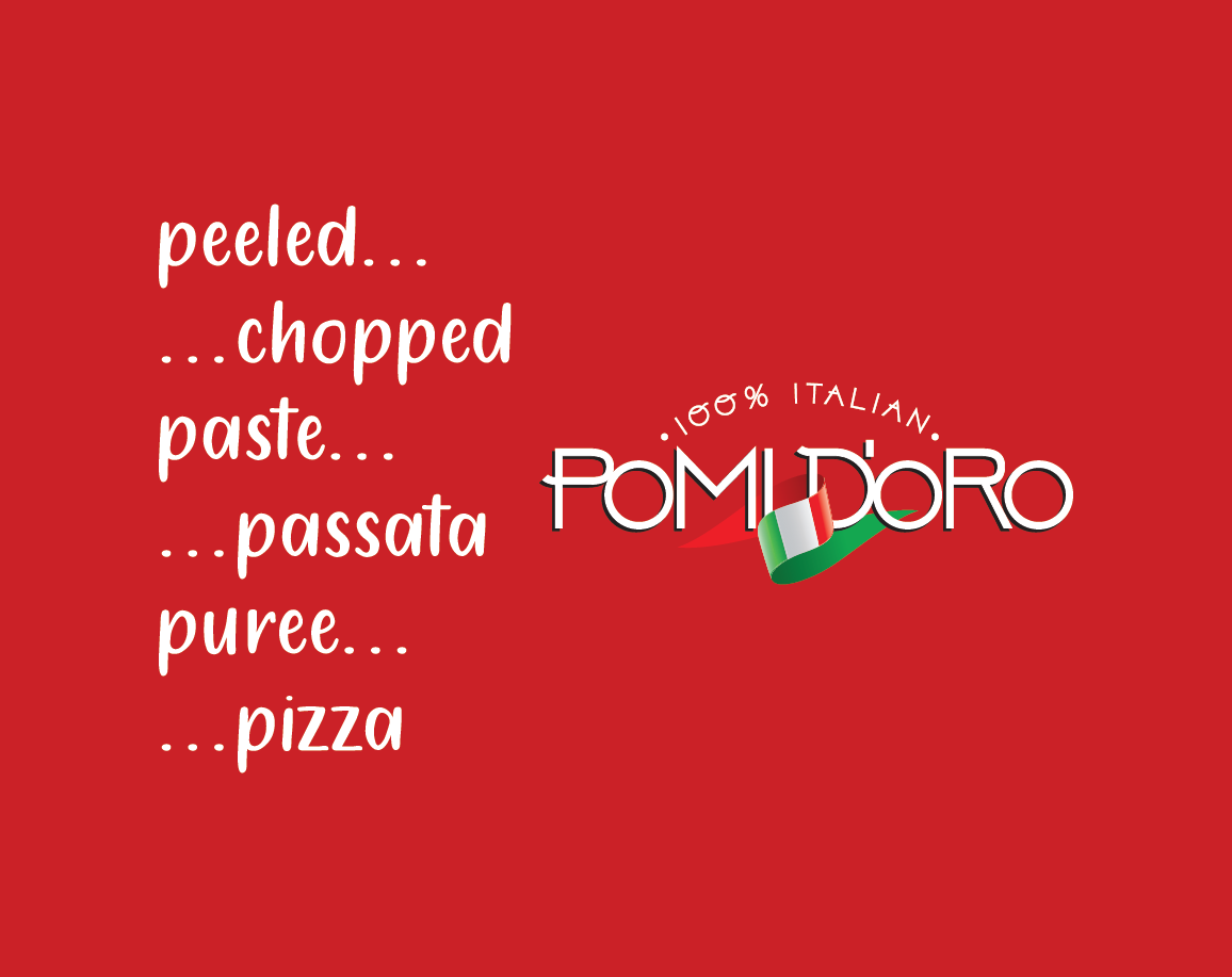
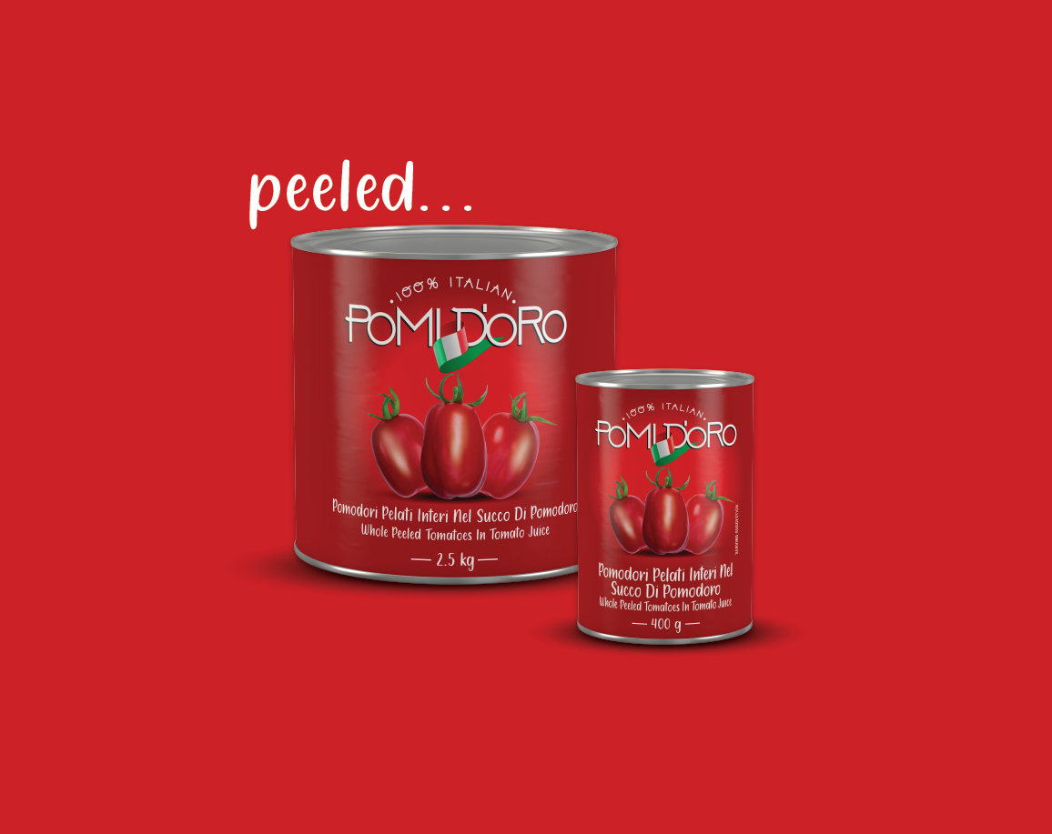
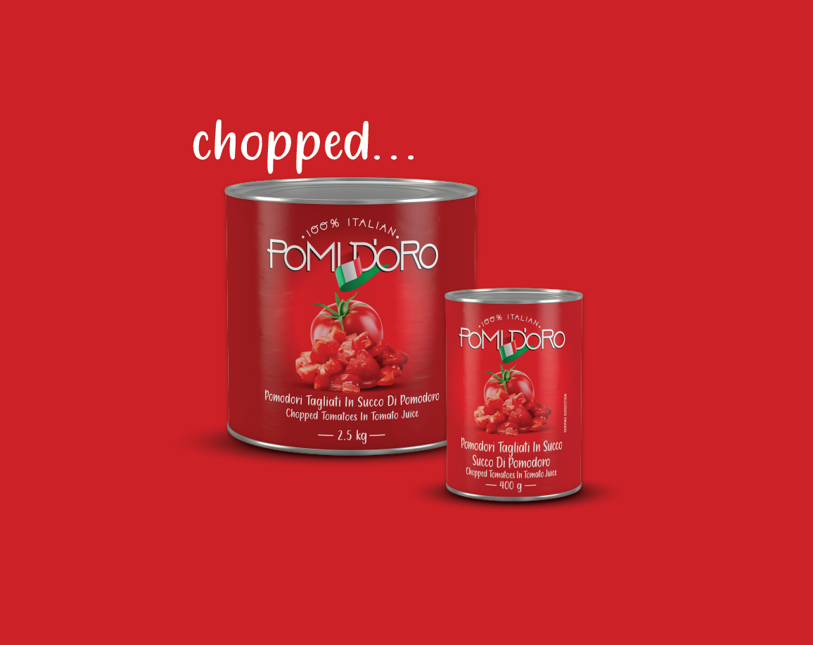
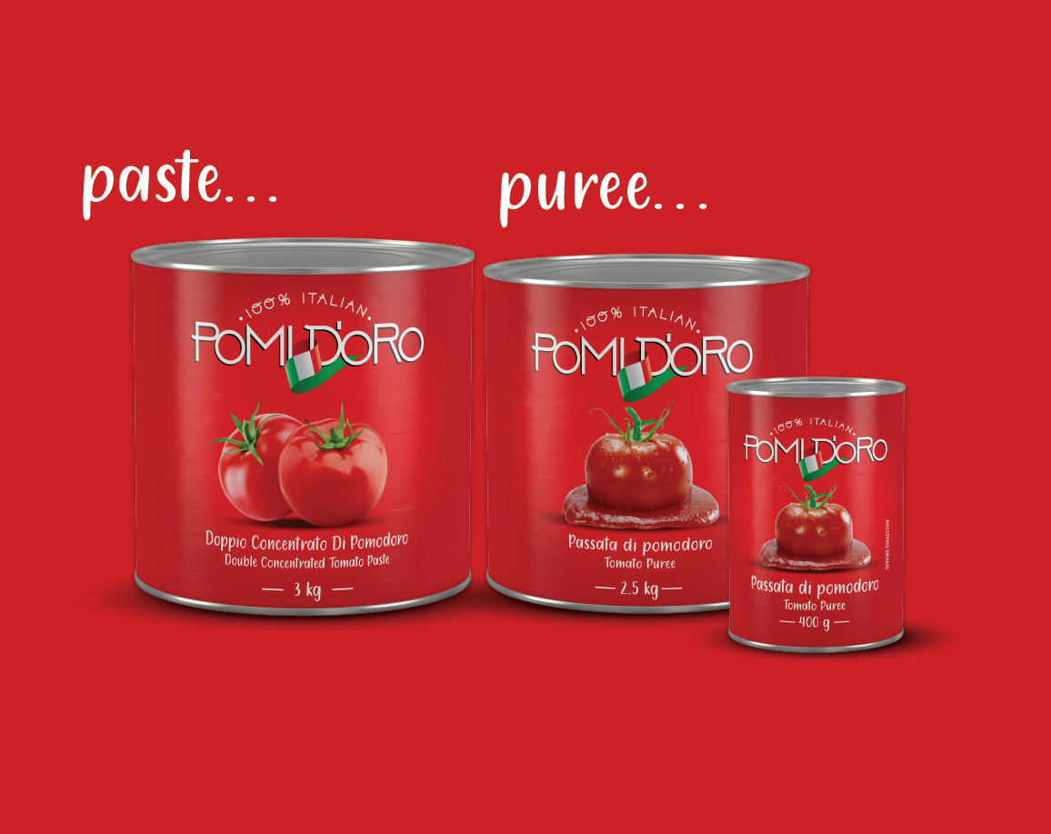
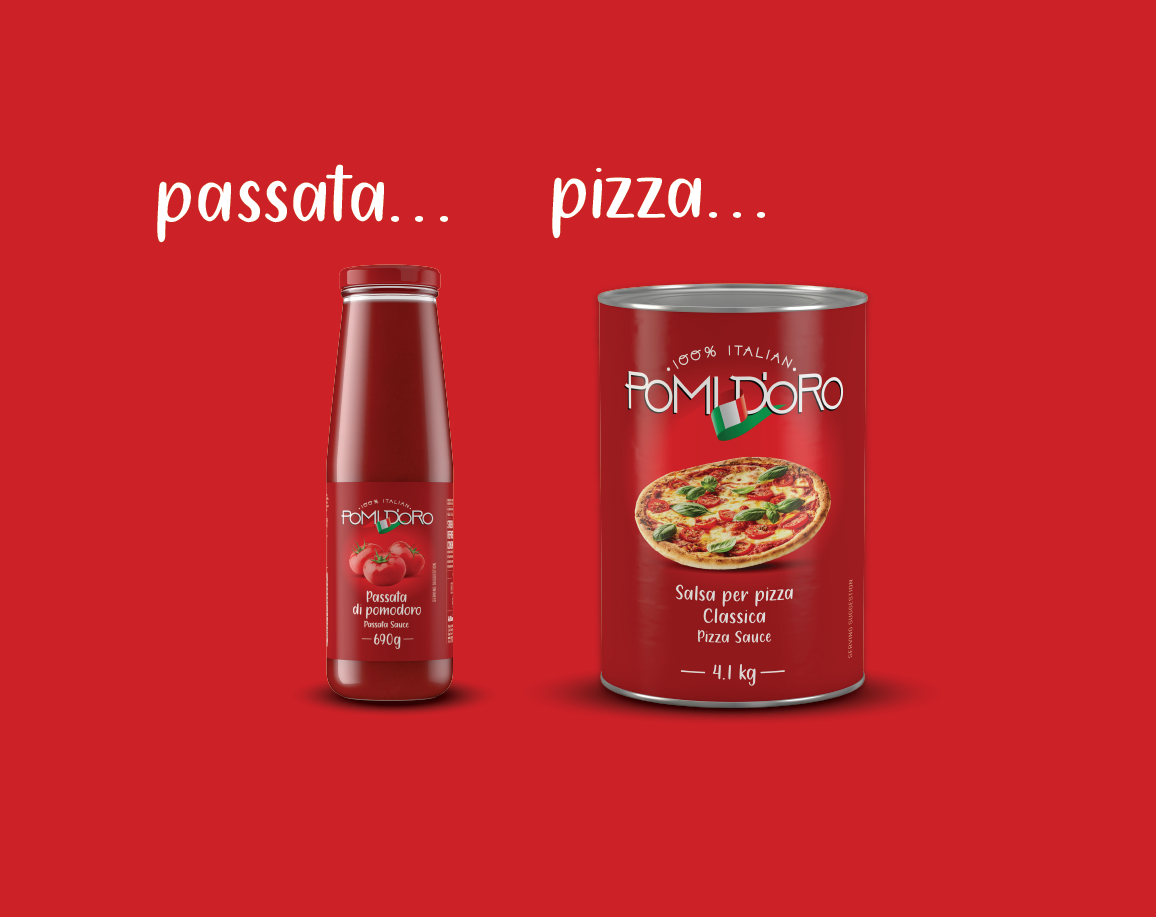
For the launch of Pomid’oro, our team crafted a branding and packaging design that places the essence of sun-ripened tomatoes at the forefront. Pomid’oro features a range of tomato products including whole peeled tomatoes, chopped tomatoes, tomato paste and puree, as well as pasta and pizza sauce.
Our design approach centers around a bold tomato-red backdrop that enhances the visibility and impact of each product. By showcasing the rich, vibrant color of tomatoes, we emphasize the freshness and quality that Pomid’oro embodies. The packaging prominently displays each tomato product, ensuring that the authenticity and superior quality of Pomid’oro’s sun-ripened tomatoes are immediately evident.
Design Highlights:
Bold Tomato-Red Backdrop: Enhances visibility and draws attention to each product, reinforcing the brand’s focus on authentic, high-quality tomatoes.
Prominent Product Display: Highlights the range of tomato products, emphasizing their freshness and premium nature.
Focus on Authenticity: Reflects the commitment to sun-ripened tomatoes sourced from esteemed Italian growers.
Outcome
The Pomid’oro packaging design successfully captures the essence of sun-ripened tomatoes, showcasing their authenticity and quality. The bold design elements ensure that Pomid’oro stands out on the shelf, effectively communicating the premium nature of the product range and celebrating the rich heritage of Italian tomato cultivation.
WHAT WE DID:
Identity Design | Brand Positioning | Packaging Design | Artwork | 3D Rendering
- Date August 28, 2021
- Tags 3D Rendering, Artwork, Brand Positioning, Logo Design, Package Design