OHMAGLOW!
Project Overview: OHMAGLOW! Brand Creation – Elevating Natural Beauty
Client: Intacraft
Objective: Develop a brand identity and packaging design for OHMAGLOW!, a premium 99% plant-based hair and scalp oil range, that conveys purity, sophistication, and a commitment to natural ingredients.
OHMAGLOW! Packaging Design
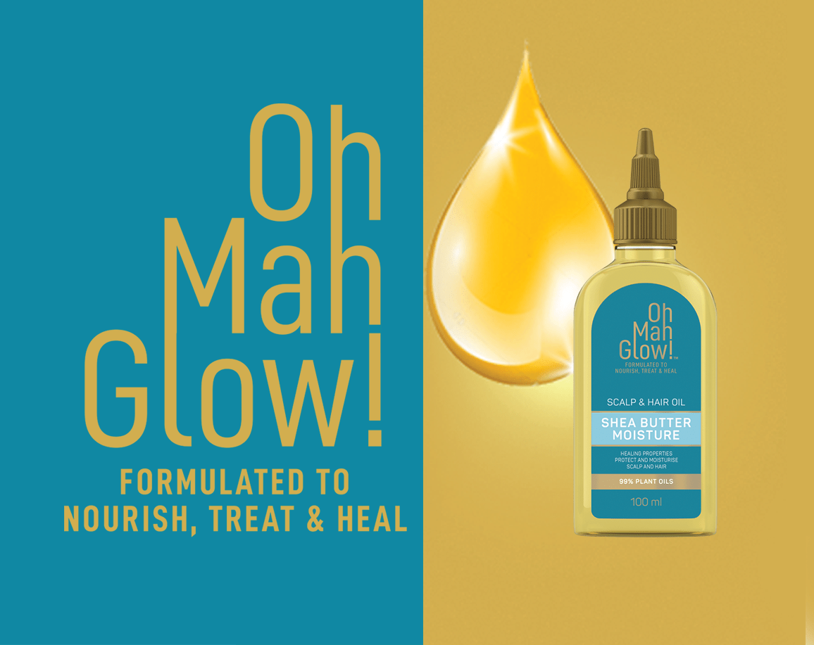
The packaging for OHMAGLOW! is a testament to the brand’s dedication to natural beauty and high-quality ingredients. Our design approach centered on creating a fresh, clean, and sophisticated aesthetic that resonates with consumers seeking premium, plant-based hair care solutions.
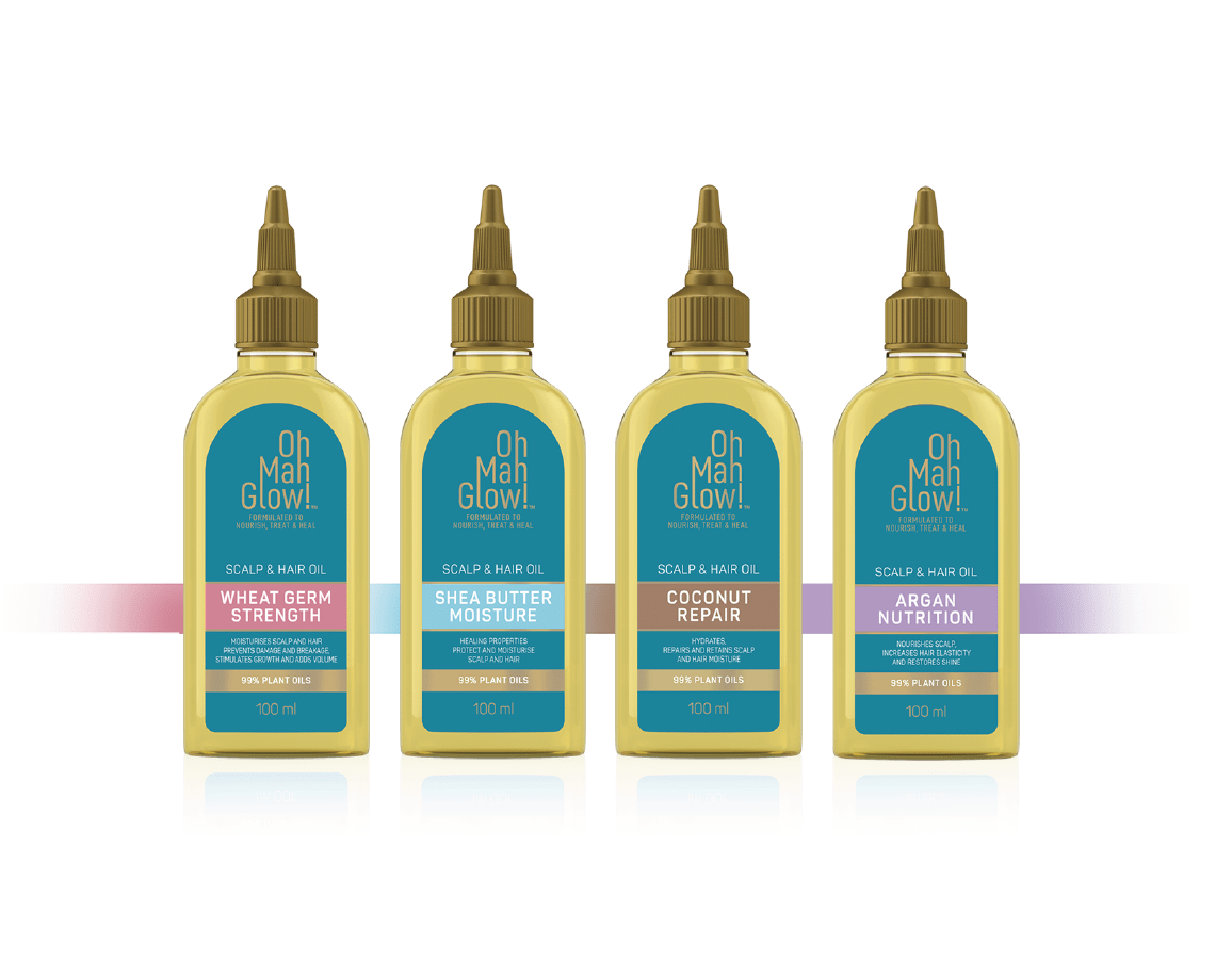
We employed a minimalist design to underscore the purity of the ingredients, allowing the product’s natural benefits to take centre stage. Each variant within the range is distinct yet cohesive, ensuring a visually compelling presence on the shelf.
The brand’s distinctive asymmetrical emblem is a key design element, symbolizing natural luminosity and capturing the essence of OHMAGLOW!. This emblem, combined with the clean design, not only draws attention but also reinforces the product’s conscientious and luxurious nature.
Design Highlights:
Minimalist Aesthetic: Focuses on the purity and quality of the ingredients, creating a clean and sophisticated look.
Asymmetrical Emblem: Represents natural luminosity, making the packaging eye-catching and reflective of the brand’s values.
Distinct Variants: Each product variant is visually unique yet maintains a cohesive brand identity, enhancing shelf presence.
Outcome
The OHMAGLOW! brand packaging successfully embodies the essence of natural beauty and sophistication. By merging elegance with clarity, the design ensures that OHMAGLOW! not only stands out in a competitive market but also resonates with consumers who value premium, plant-based products.
WHAT WE DID:
Identity Design | Brand Positioning | Packaging Design | Artwork | 3D Rendering
- Date August 28, 2021
- Tags 3D Rendering, Artwork, Brand Positioning, Logo Design, Package Design